Finally Learn to Use Color.
Stop dulling your palette and start bringing vibrant color into your paintings with this digital workbook.
Instant PDF Download
Step by Step Guide
Learn How To:
Distinguish value from saturation
Observe temperature shifts across form
Use analogous colors to preserve saturation
Build rich halftones to enhance dimension
Mix chromatic shadows using complements
Apply color theory principles to painting from life
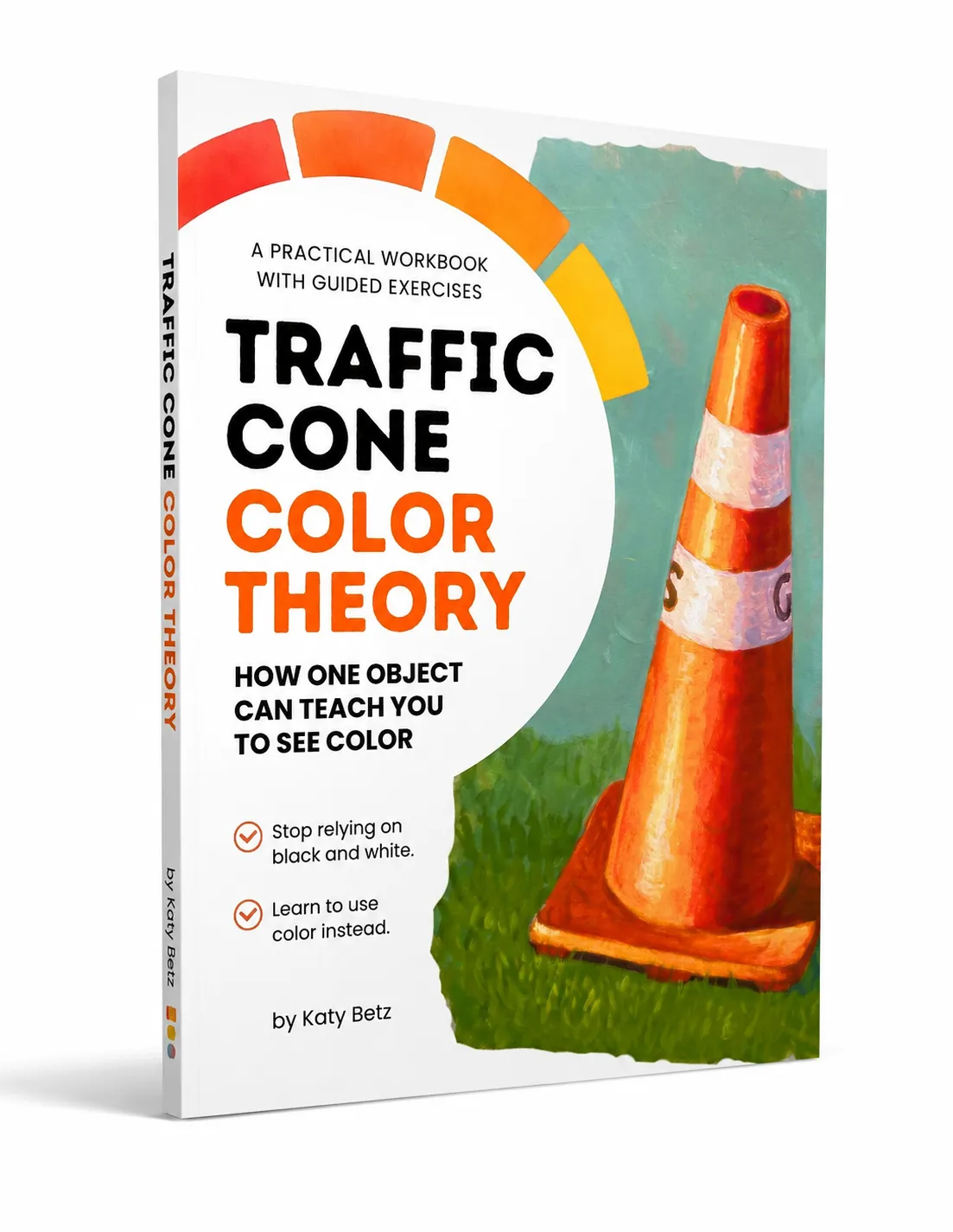
The digital PDF workbook can be downloaded and printed or viewed on all digital devices.
The Problem with Basic Shading
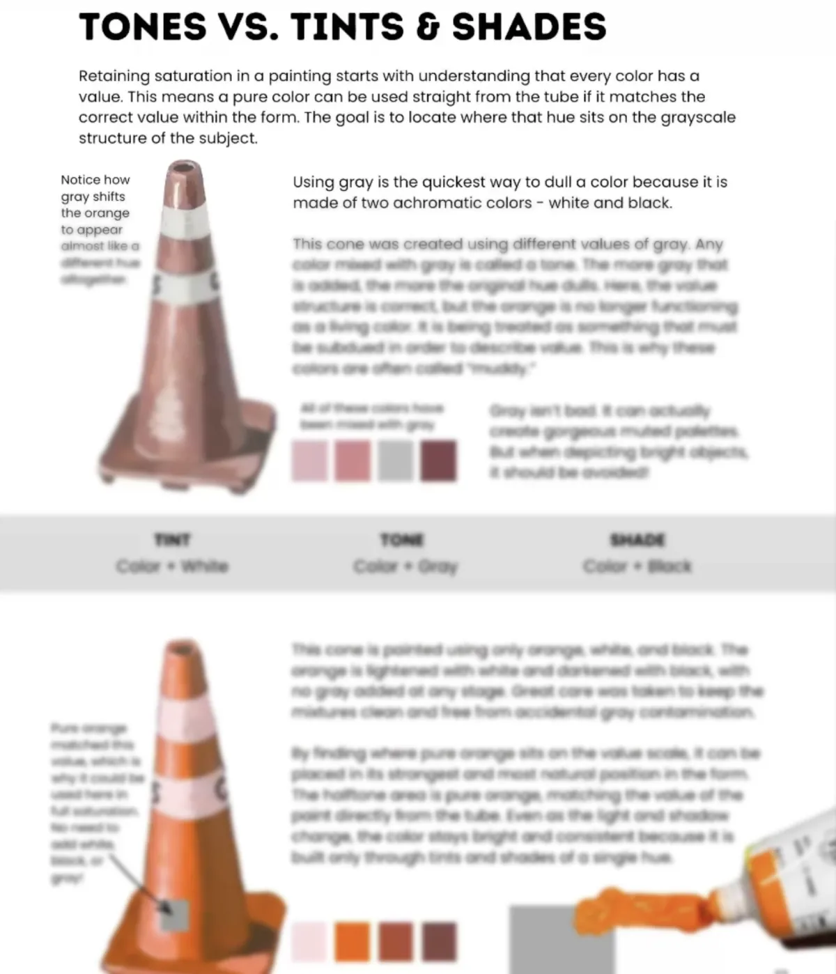
Most beginners are taught to add black for shadows and white for highlights. But this immediately dulls your color, leaving your paintings looking muddy, chalky and lifeless.
Muddy Shadows
Adding black or gray to darken a color often creates a lifeless, muddy gray that destroys the vibrancy of your original hue.
Chalky Highlights
Relying on white for highlights washes out pigment, making your bright areas look chalky and pastel instead of luminous.
The Solution
Learn to use complementary colors, temperature shifts, and analogous hues to create depth while maintaining maximum saturation.
Why a Traffic Cone?
A traffic cone is the ultimate test of color vibrancy.
It's designed to be the brightest, most attention-grabbing object on the road.
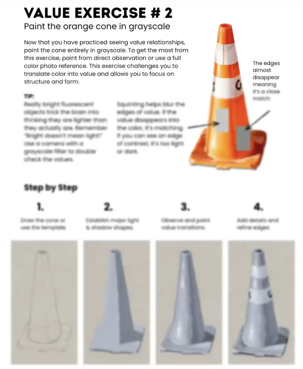
If you can paint a realistic traffic cone with colorful shadows and bright highlights without using fluorescent orange, you can paint anything bright.
Learn to shade orange using blues and reds instead of black.
Create glowing highlights using neighboring colors.
Understand ambient light on highly saturated surfaces.
Build color-mixing confidence through step by step exercises.
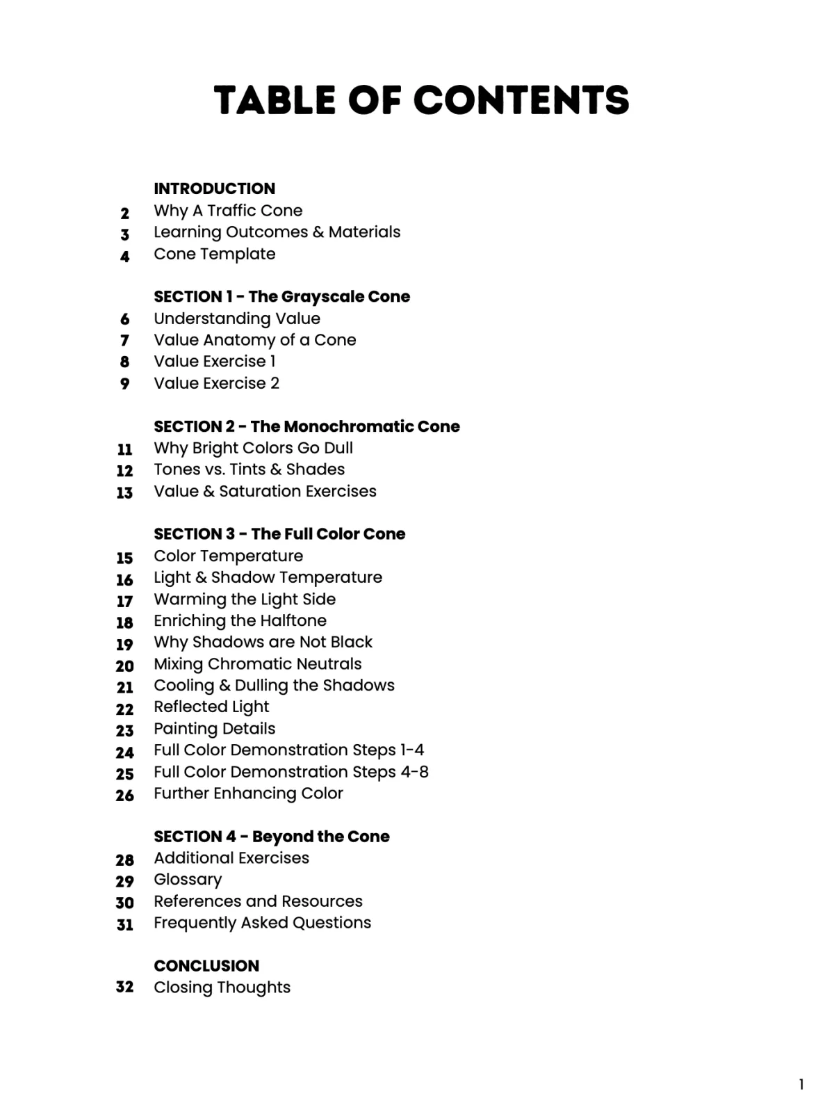
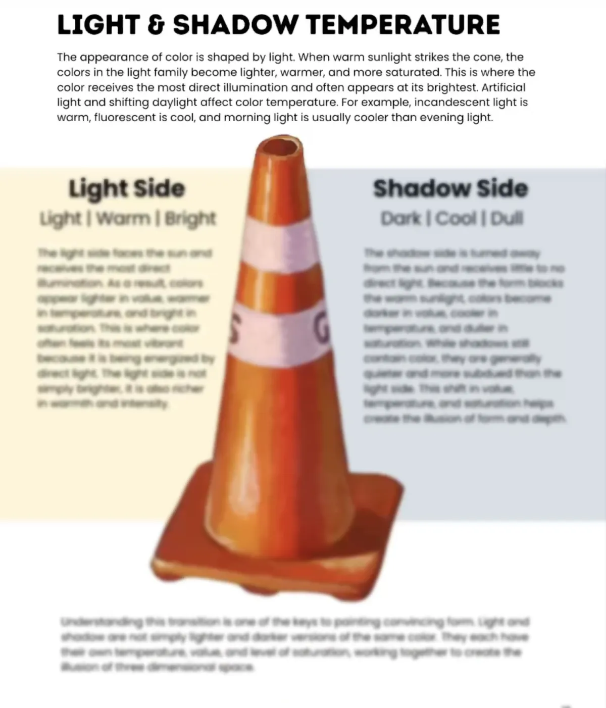
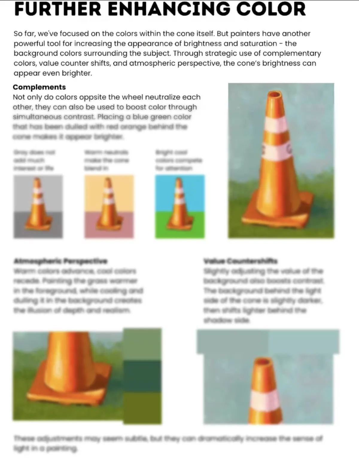

Images intentionally blurred
Get the Workbook
Traffic Cone Color Theory
34-Page Digital PDF Download
Total
$19.00
Is this for beginners or advanced artists?
This workbook is perfect for beginners who struggle with muddy colors, as well as intermediate artists looking to refine their understanding of color temperature and saturation.
What medium is this for?
All! The principles apply to any opaque medium: acrylics, oils, gouache, and digital painting. The concepts of color theory are universal.
How do I get the workbook?
After purchase, your PDF will be ready to download immediately from your browser, and you will also receive an email with a link to download the file.